Reclaiming a Bedroom
Last updated August 21, 2024
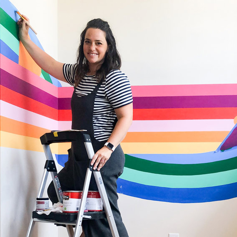
Racheal Jackson is a muralist and designer who has made it her life’s passion to recapture the freedom of color and creativity in people’s homes. She paints murals in homes and businesses across the country under the name Banyan Bridges. Her work has been featured in Better Homes and Gardens, HGTV magazine, Real Simple, Domino and others. She stars in the TV show Artfully Designed on the Magnolia Network.
A Note From The Home Depot
Learn how to re-do a bedroom with muralist Racheal of Banyan BridgesBanyan Bridges, as she takes on a project using the power of paint to turn her kids’ room into the coolest space in the house!
Table of Contents
Reclaiming My Kids' Bedroom
A Swift Kick
My One-Coat Dreamboat Ceiling
Toning Down the Floors with a Great Wall Color
Finding a Focal Point
Shuffling the Checkerboard Colors
Reclaiming My Kids' Bedroom
I love my kids, but you wouldn’t know it if you saw their bedroom. To be completely clear, they are not the problem. I just couldn’t figure out what their room was supposed to be. Their bedroom has always felt a little disjointed and incomplete, but I had no solution in mind.
I’ve started and stopped a redo of this room so many times. The projects never get done—they just stall and burn out. You can literally see my dead-end projects everywhere.
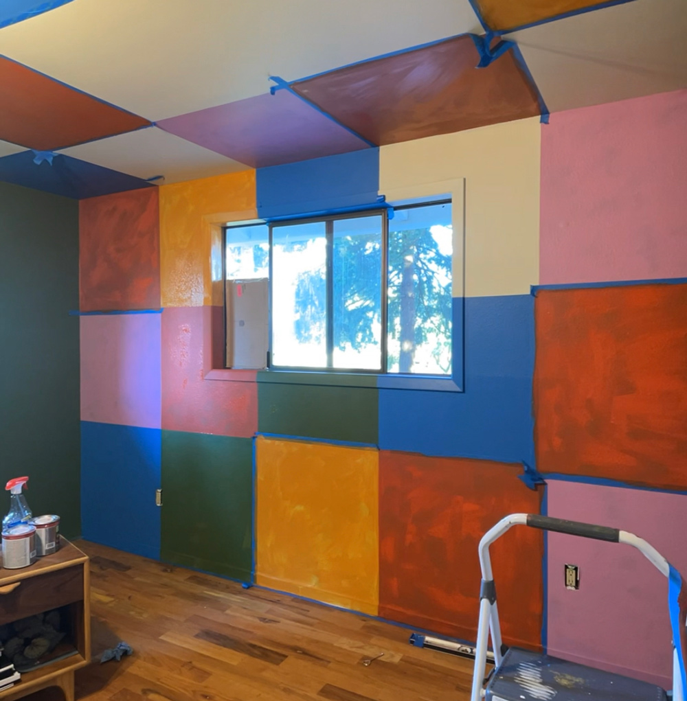
Because of this room’s unfortunate ranking it often becomes my go-to dumping ground for misfit furniture.
No room in your home should become the perfunctory junk drawer. And sometimes, all you need is a kick in the pants.
A Swift Kick
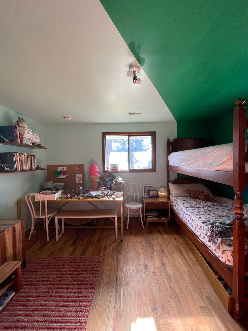
One of my most recent attempts was to move in bunk beds into the space. Then a few months later, our youngest fell off the top bunk. Luckily, he’s okay. He either has a bright future as a paraglider or a timid one—clinging to the railing of every stairwell.
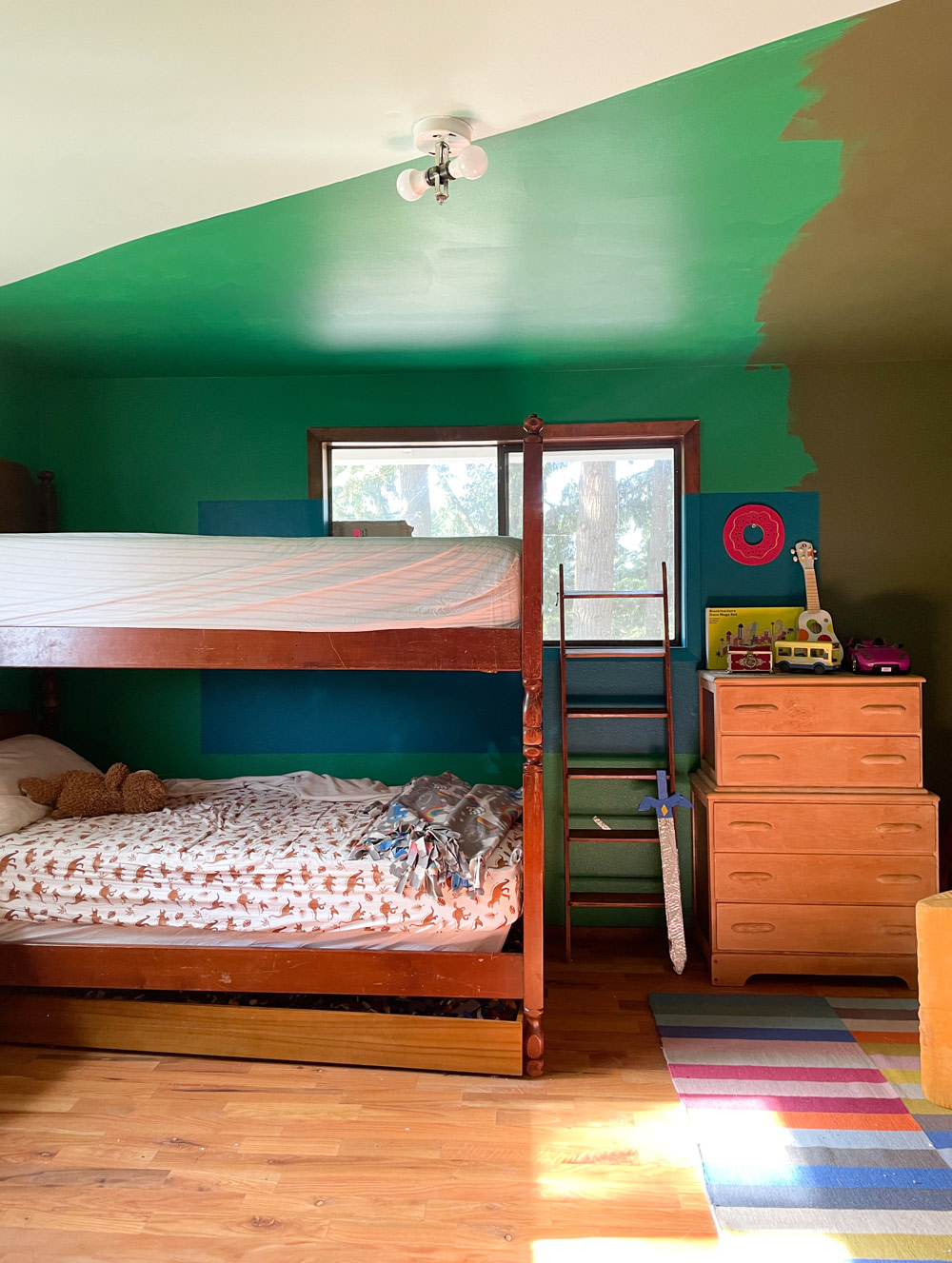
Since then, he has been sleeping on our Nugget on the floor. After a week or two of that, I realized I couldn’t put it off any longer. The space needed to be fixed.
When I sat down to re-evaluate the space, the first objective was clear: separate that bunk bed. Once I made that the guiding decision, it led to a cascade of great decisions that made their room more functional and visually appealing. We removed all the furniture from the room so I could see it without any of the previous projects crowding my brain.
My One-Coat Dreamboat Ceiling
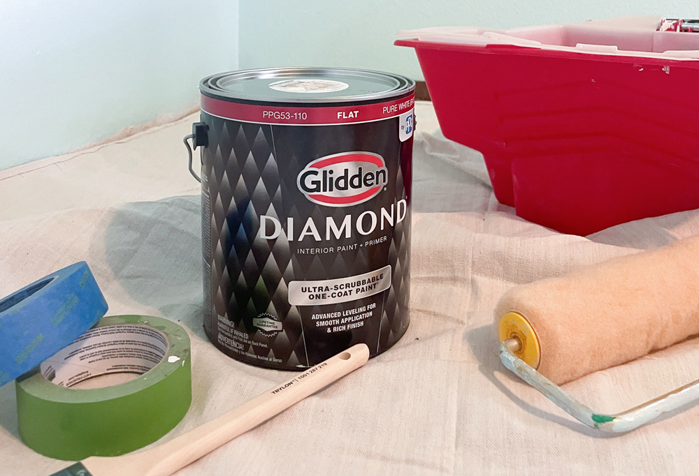
With that clarity, I turned to getting a solid visual foundation. I painted the ceiling the color Ivory Tower with Glidden Diamond one-coat-coverage paint. While they are sponsoring this post, I can honestly say, it took my breath away. There were three colors on that ceiling previously—olive, dark green, and light blue. I really put the one-coat to the test and was amazed to see it cover the ceiling BEAUTIFULLY! I was ecstatic! I’ve painted so many ceilings and it’s always a miserable process. Your shoulders and neck ache for days after sometimes. It can be exhausting. And here I was with a complicated ceiling pattern with strong colors and a bucket of white paint. It was done so fast—with hardly any touch-ups. My day was completely made and it was less than $30 per gallon.

I cannot adequately express to you how satisfying that was.
Toning Down the Floors with a Great Wall Color
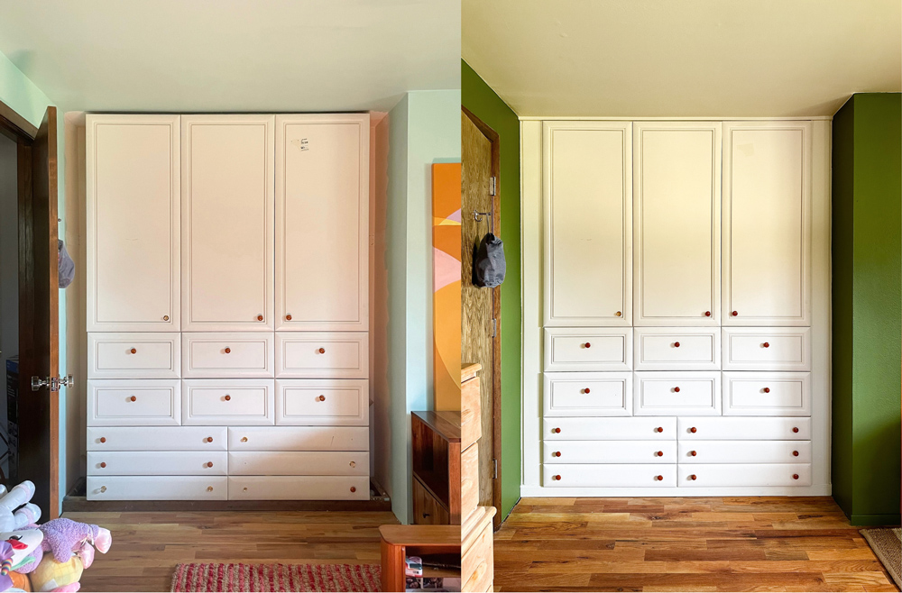
I wanted the walls to be green—I could feel it in my bones. I tried to avoid neutral colors unless they are necessary, so I needed color. But a primary goal of mine with the wall color was to tone down the orange in the floors. The natural tone of the floor can be a little intense, but I realized how much of that was that previous wall color was at fault.
I tried a bunch of different olive tones. I’ve got an embarrassing amount of swatches in my pockets. And then it happened: I fell in love with Glidden Diamond’s Oakmoss . It’s the perfect base that makes any art or other colors around it sing. It’s deep enough to mask a lot of the pencil or scuff marks that are bound to happen in a kids’ room and the ultra-scrubbable paint makes cleaning it a breeze!
As another finishing touch, I trimmed out the built-in wardrobe area. It’s been on my list for so long and I couldn’t let it keep being a sore thumb in this room that was about to be revolutionized.
Finding a Focal Point
I feel strongly about the need for focal points in a room. Having a focal point helps ground a room. It’s a relief to walk into a space that knows where it wants to direct your attention when you first walk in. There is something soothing to my brain when that happens. I feel more centered.
The walls and ceiling made such a strong foundation for a focal point. Too often, people will just settle for clean colors on the walls and won’t take a risk. I’m here to remind you to take those risks!
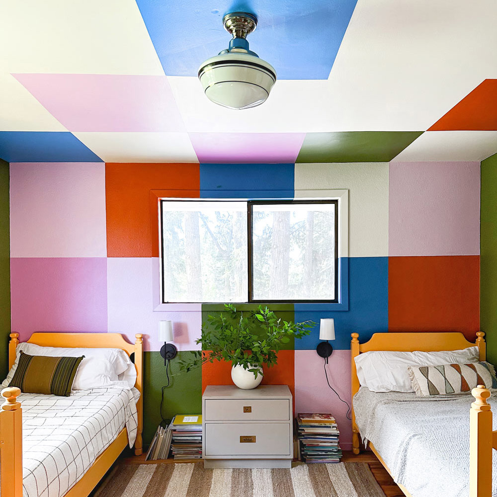
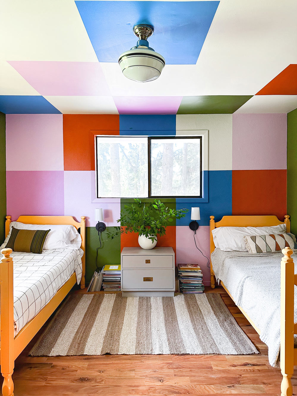
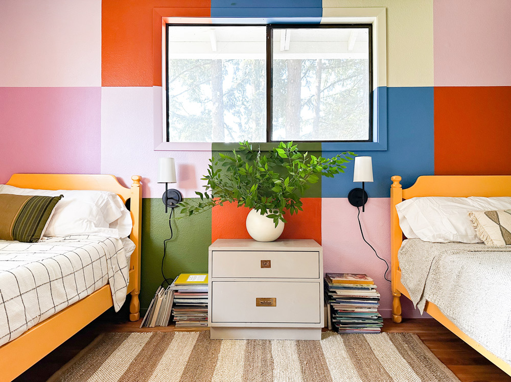
I loved the idea of an oversized randomized checkerboard pattern on our hero wall. Our wall was close to 150 in x 90 in so I created a roughly 30 in square grid on the wall. I sketched up a design on my computer so I could play with some different ideas. This can make all the difference and helps me refine my ideas before I open a can of paint. After I experimented, I established a good color distribution and started painting!
Shuffling the Checkerboard Colors
I regret to inform you that once I got the first coats of paint on the wall, I started to cringe a little bit. The color balance of my palette was so off! It started to feel a little bit like a daycare center, which is never the vibe I want to bring to a space. Often, even a pro like me will find myself having something get lost in translation from paint swatch, to computer mock-up, to paint color on the wall.

Still determined to make this checkerboard focal point come together, I made an emergency trip to Home Depot and refined my color palette. I replaced the vibrant red (that was clashing with the vibrant yellow) with a softer purple hue and the vibrant yellow with a deeper orange.
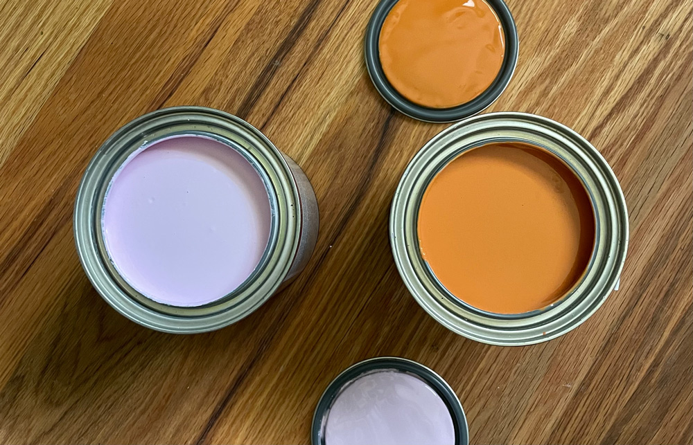
One trick I use often while building a color palette of many colors is to use two shades of the same color. It prevents you from feeling overwhelmed by too much contrast and avoids the rainbow look.
In the end, the final colors in my checkerboard focal point mural were:
And doesn’t she look cute?
Re-Envisioning Bunk Beds
Okay, I love bunk beds. They're super functional, versatile, and remind me of summer camp. But that doesn’t always mean they are right for the space.
I bought these bunk beds second-hand from a man born in 1940. His family had been using them for a decade or two before he was born. They are STURDY and super cute, which are my two main requirements for furniture. Their finish had started to flake and in many areas was already nearly gone.
I usually hate when people paint old wood, but this makeover made sense to me. I usually hate when people paint old wood, but this makeover made sense to me.
Painting something like this shouldn’t be a last resort. Too often, painting over old wood is just a simpler option and people do very little prep and don’t buy the right paint.
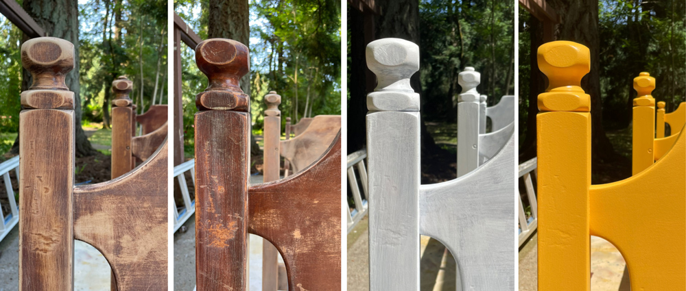
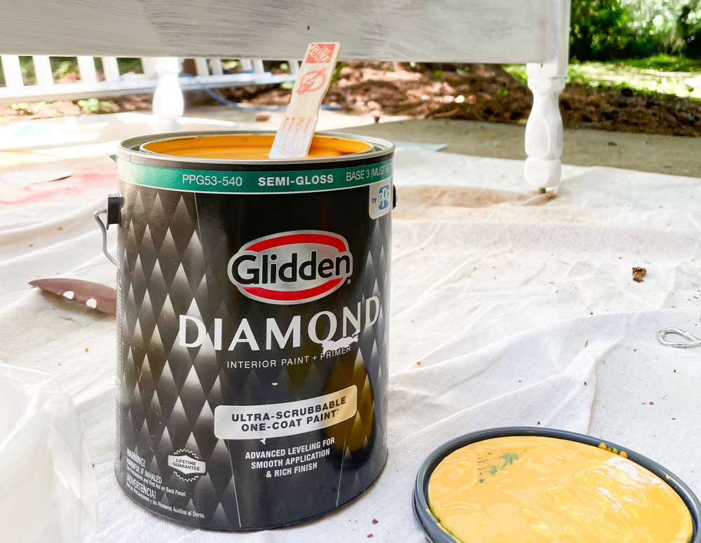
In order for this makeover to last, I knew my prep work had to be impeccable. I sanded the full bunks and wiped them down with tack cloths. Next, I primed them and then painted them Glidden Diamond Yukon Gold using my favorite sprayer . Spraying took only 8 minutes per coat. I highly recommend going that route.
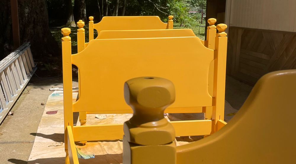
The beds turned out so great and immediately changed this bedroom from something that felt dark and heavy to something playful and fun. Plus, the sturdy and great woodworking got some new life!
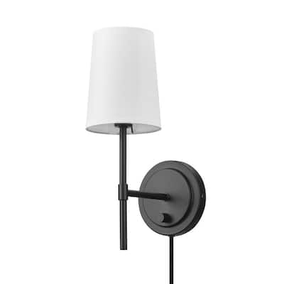
I really wanted the beds to feel even more connected to the space so I turned to some plug-in sconces
that I found at Home Depot. I mounted them on either side of the nightstand.
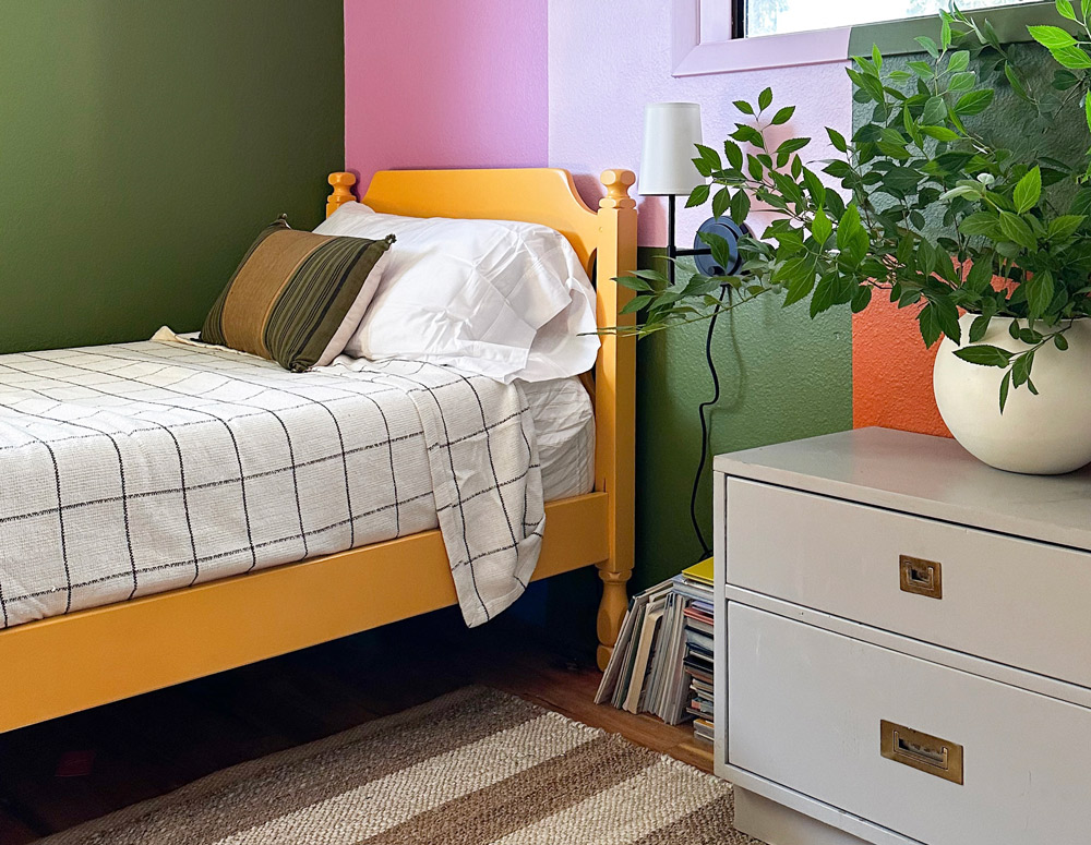
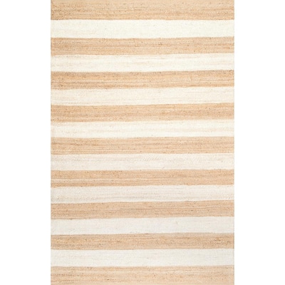
A cute jute rug also helped make the beds feel incorporated in the space and created a visual cue between the two beds. Even though they are separated now, they still clearly belong together.
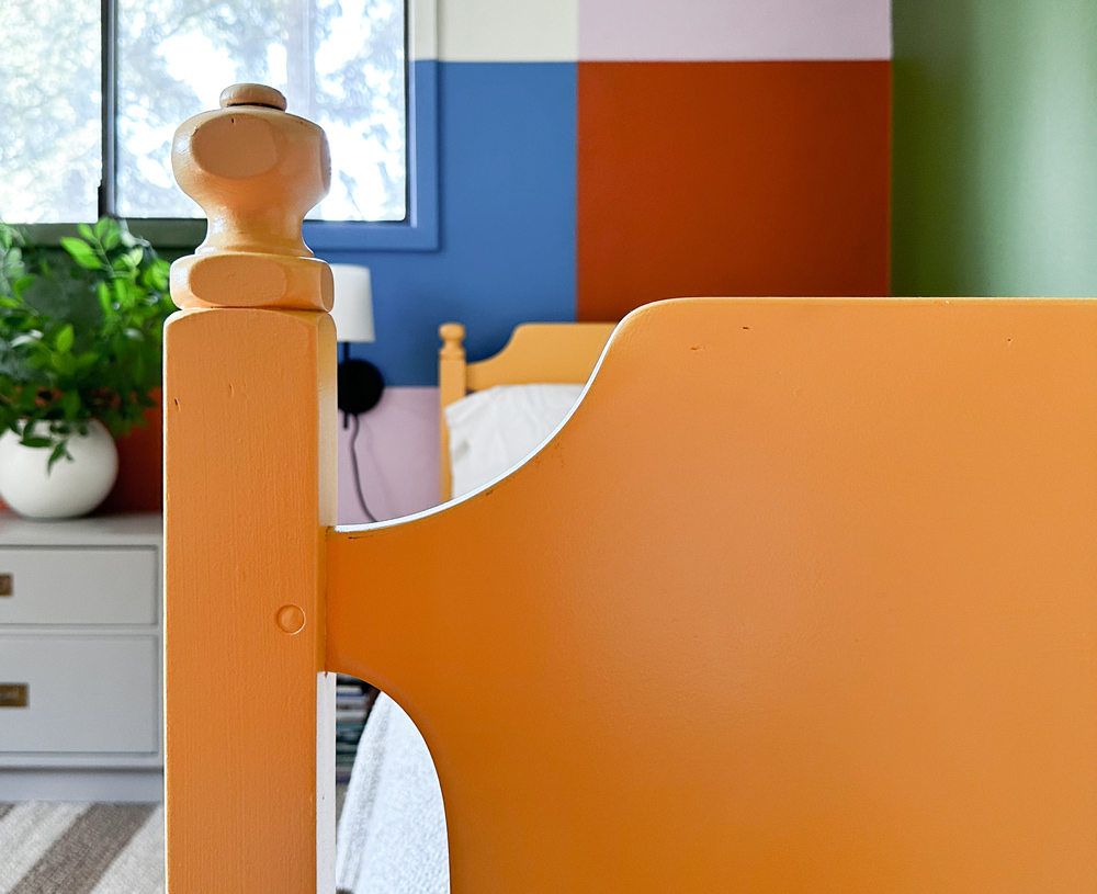
With a final touch of some cut branches, the space finally came together! These beds are such a dramatic change to the space. This side of the room used to be a vortex that would fill your field of vision with darkness. Now the focal point draws you into the space and down at the two cutest little beds.
It’s super cute and I’ll enjoy it for as long as I can until the kids inevitably coat the space in Legos.
Restoring a Makerspace
As I mentioned at the top, the gorgeous dining table that was in here for the kids was way too big and was giving more opportunities for chaos than it was helping. It had to go. But the two who sleep in this room are also very active artists, writers, and makers. We wanted to ensure they still had a place for them to create.
We played a bit of furniture shuffle throughout the house and freed up a thrifted desk that wasn’t getting a ton of use. It was a perfect little station that still met the functional requirements, but didn’t eat up all the space in the room.
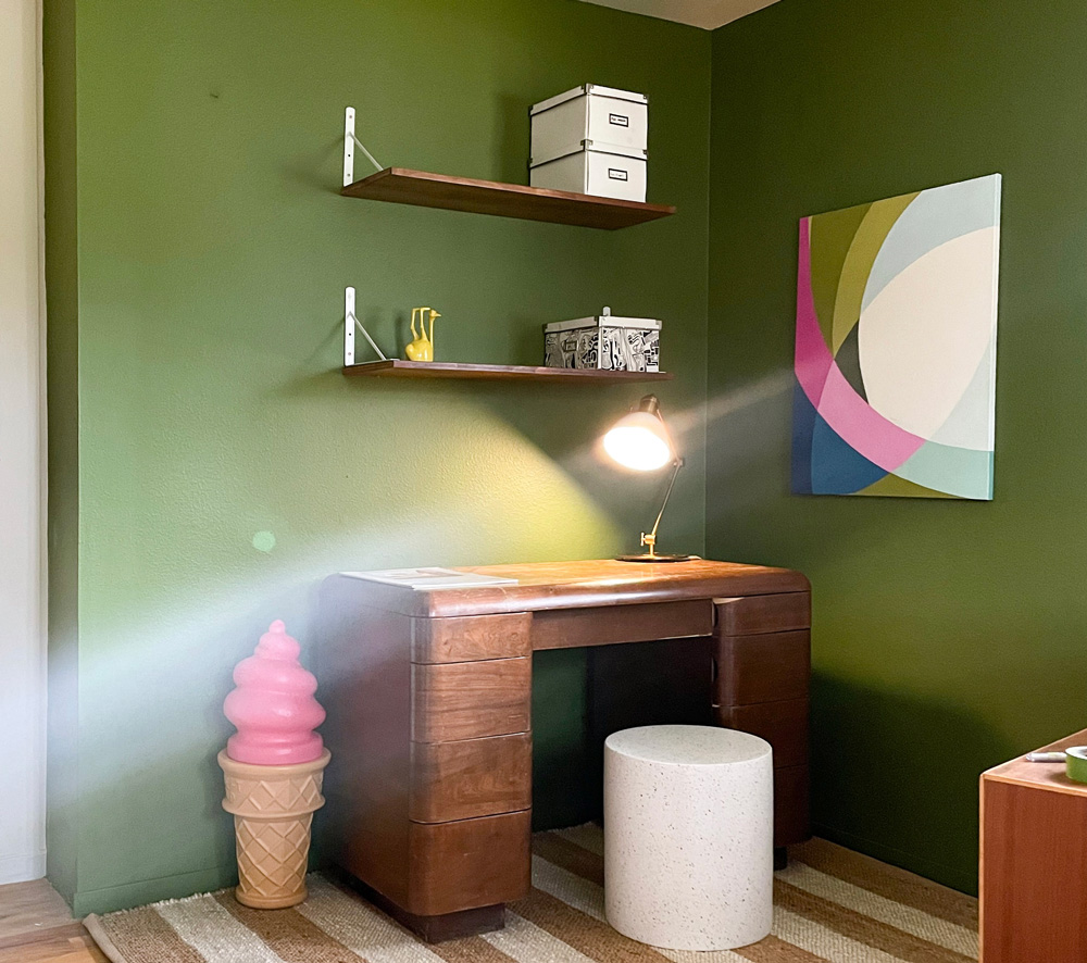
As I rehung the bookshelves, we realized our kids haven’t been reading many of these books. As soon as we had the books on the floor of another room stored while I remade this one, they started burning through them page by page. Since the shelves were put up, our two youngest have moved on from having stories read to them as the default to them reading on their own. Because they couldn’t reach the bookshelves, the books were just dormant. We moved the books down and dedicated these shelves for decor and creative project displays!
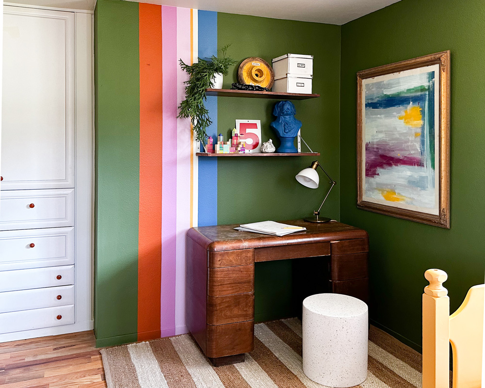
My kids trend toward chaos, so I don’t like to fill their rooms with decor. I’m usually very selective about which pieces go into each room. Rather than decor, paint can help bring a punch of color to a space like this.
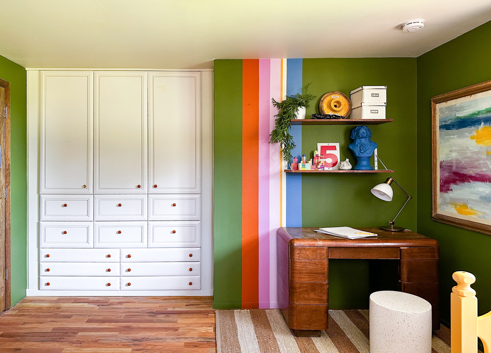
Stripes to the rescue! The thing I love about a set of stripes is that it’s SUCH a fast project. These took me less than 4 hours to paint, from start to finish. They add color and fun in a way that’s not going to make a mess for the kids to clean up every time they clean their room.
The playful makerspace mural stripe wall colors were:
Lucky Penny
Mooreland Heather
Pink Peony
Yukon Gold
Ivory Tower
Ship’s Harbor
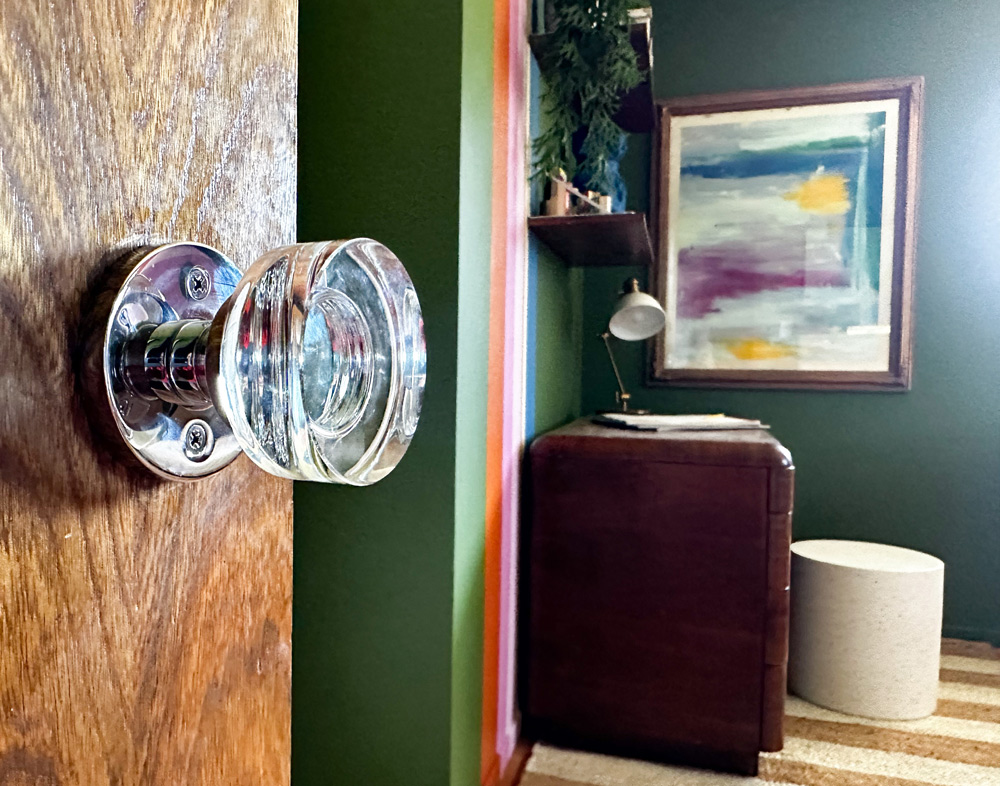
Disjointed to Destination
And after all that struggle, this room is my favorite room in the house. It feels fresh and welcoming in a way I never would have imagined. Since we put in the beds, I’ve been wanting to hang out in here with them. That means more books at bedtime and more time connecting.
I couldn’t be happier that with a little paint, I was able to create a space where we can grow together!
This post was created in partnership with The Home Depot. The author may have received compensation for this article and associated images or video, potentially in the form of products and/or services. All expressed opinions and experiences are the author’s own words.

